Background:
I have been making logo designs and branding for years since the popularity of rapidograph pens. With the evolution of technology allowing the use of digital typefaces and vector graphics, I have become more passionate to expressively design logos and brand identity.
Following my own research on the web, I did redesign the logo of a professional foot care doctor in New York which reflects his brand identity. I also photographed some key images needed for postcards, t-shirts, uniforms to promote his services.
User Interface


Previous logo

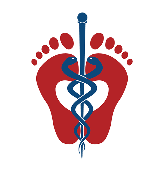
Design Challenge:
The above logo was assembled on Illustrator in January 2018 using bold sans-serif fonts. To come up with the new logo, I joined the shapes of two feet to form a heart in the center, then finalized the emblem with a caduceus. The chosen colors were selected to convey calm and comfort relevant to a staff of foot care professionals. Since then, a third party web developer was hired to help the foot doctor grow his practices online.
Image edited for postcards!
This edited image is actually a combination of 2 photos carefully retouched to showcase springiness after treatment of aching feet. The background of the original picture was removed to only expose the feet on a smooth carpet. I added a light shadow to simulate a picture taken in a design studio.

Check out my portfolio, experience my creative strategies, and get in touch!